|
In the first photo assignment of the trimester, we were instructed to take photos that pertained to specific principles of design. These included balance, movement, repetition, emphasis, simplicity, contrast, proportion, space, and unity. - Balance - 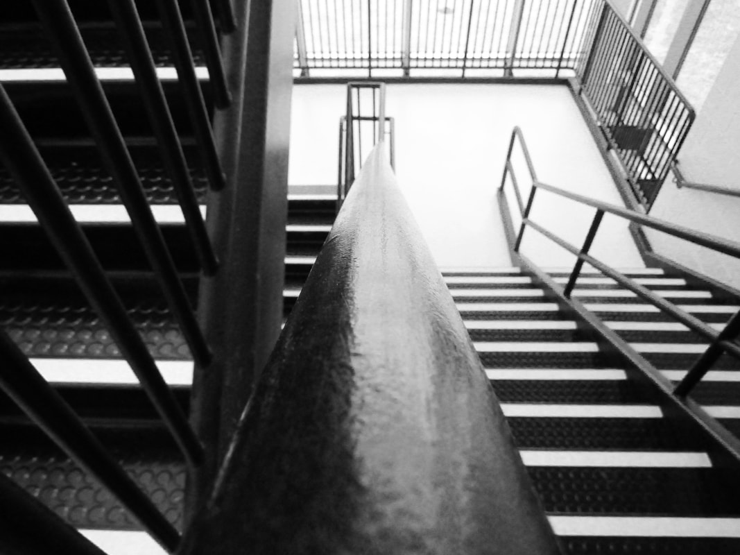 This photo represents balance because of the symmetry on both sides of the railing. - Movement - 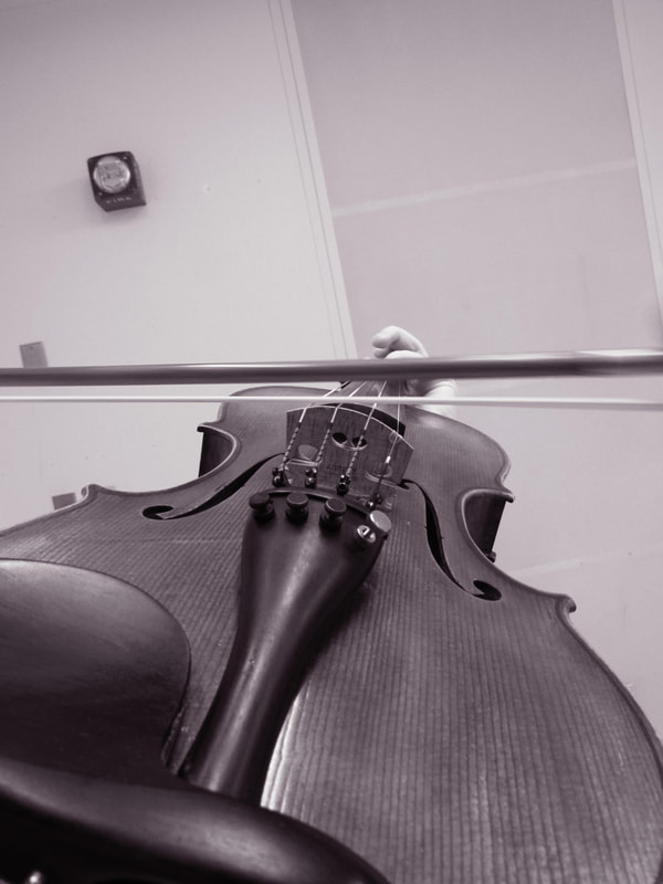 For this photo, I had my friend Josie hold my violin and move the bow. I tried to get some motion blur in, but it didn't turn out the way I wanted it to. - Repetition/Rhythm 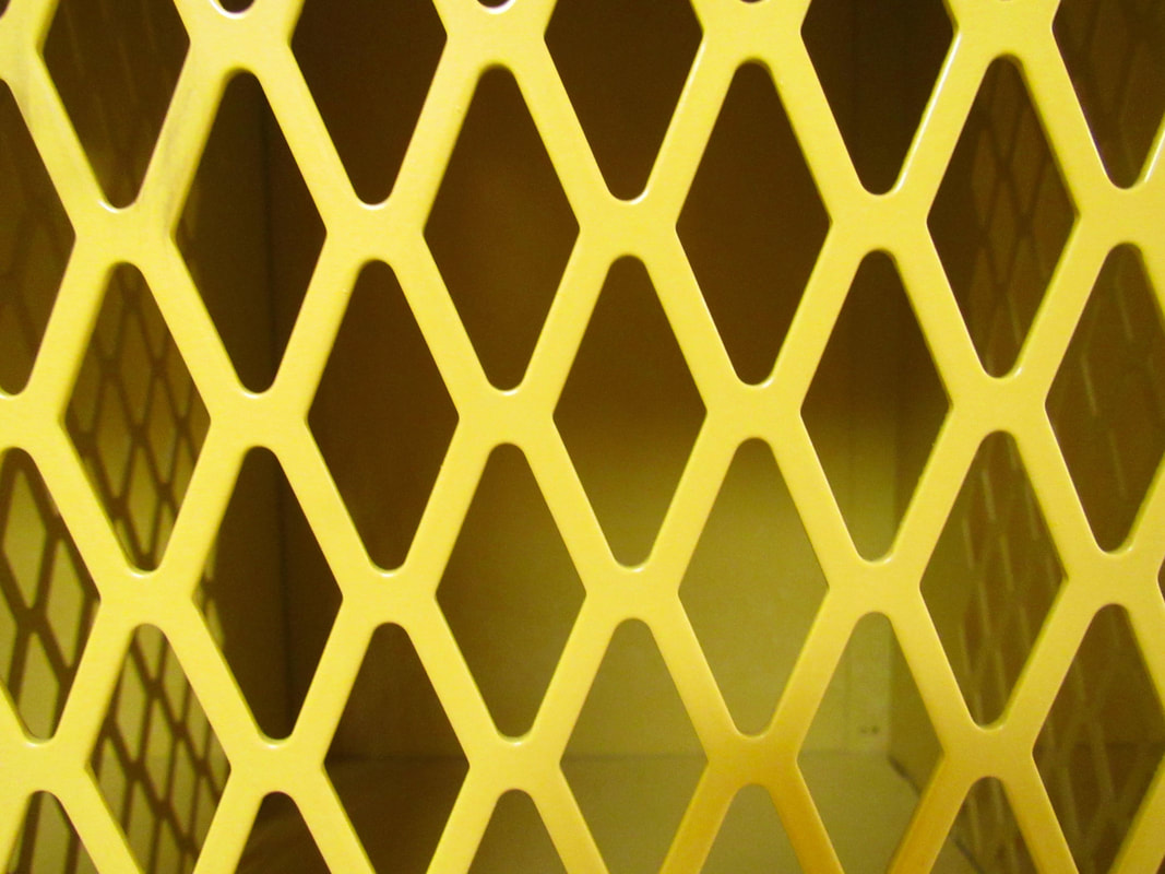 Because of the repeating diamond pattern of the locker, this photo represents repetition. - Emphasis - 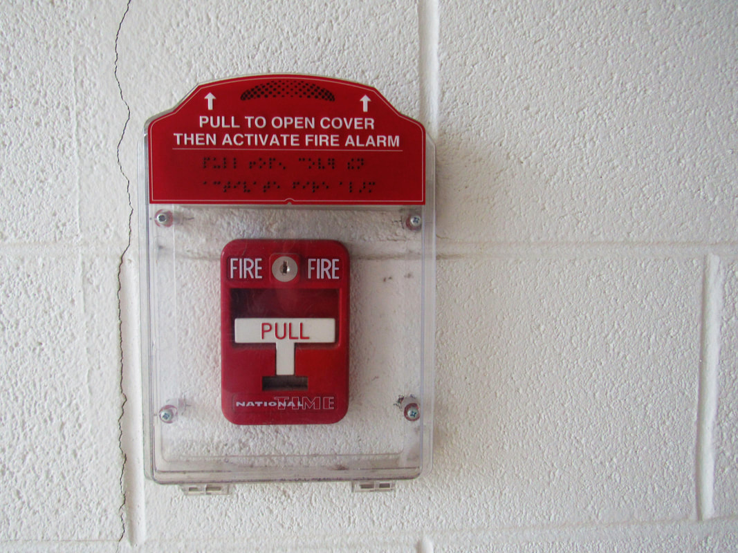 This photo might be a stretch, but I figured that, since the fire alarm is the only thing in the photo, it is emphasized. - Simplicity - 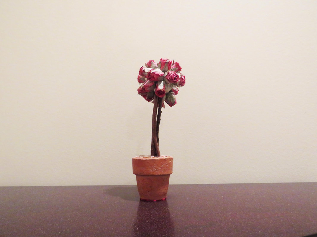 Simplicity means that the photo is uncluttered and not busy. In this one, the flower is really the only thing in the photo. - Contrast - 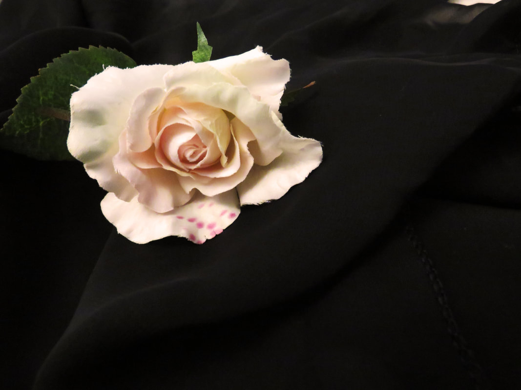 The stark difference between the white flower and black fabric gives a clear contrast. - Proportion - 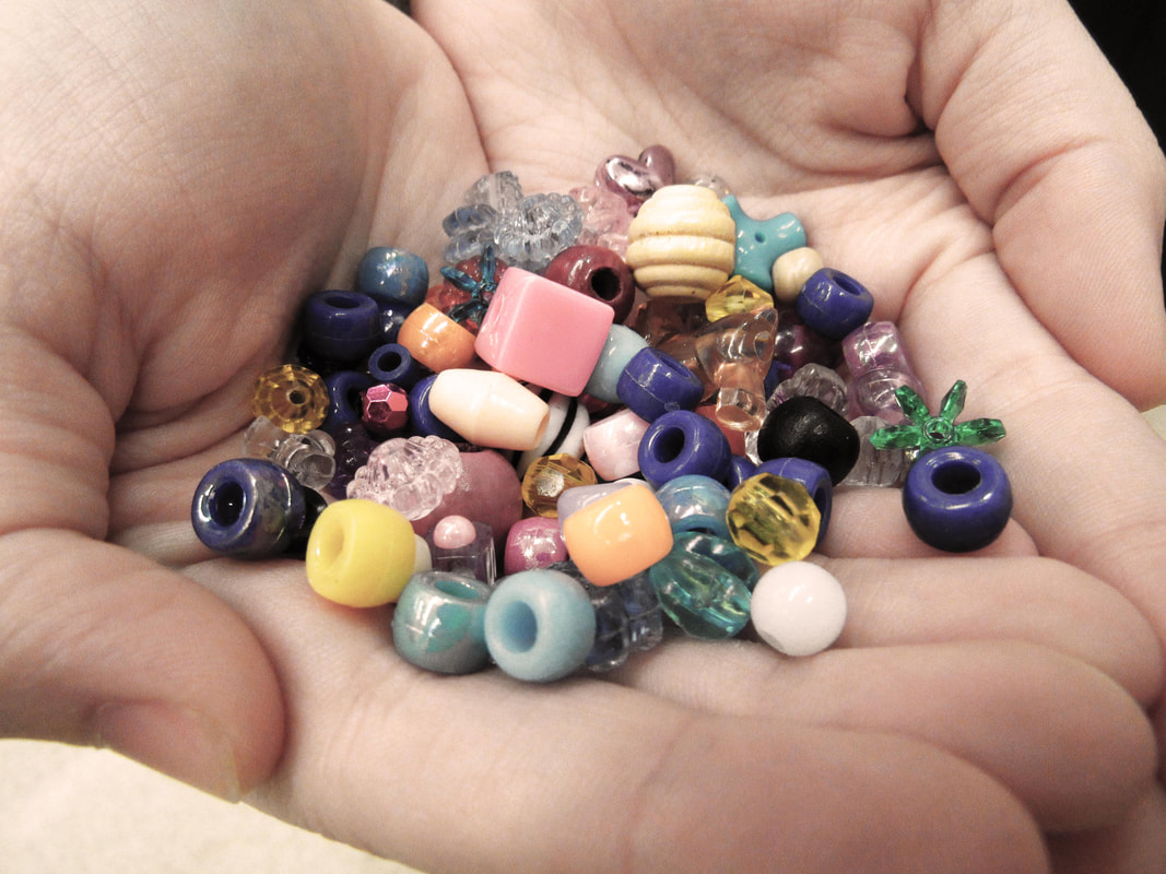 Because of the various shapes, sizes, and colors of the beads, you can compare them to each other. - Space - 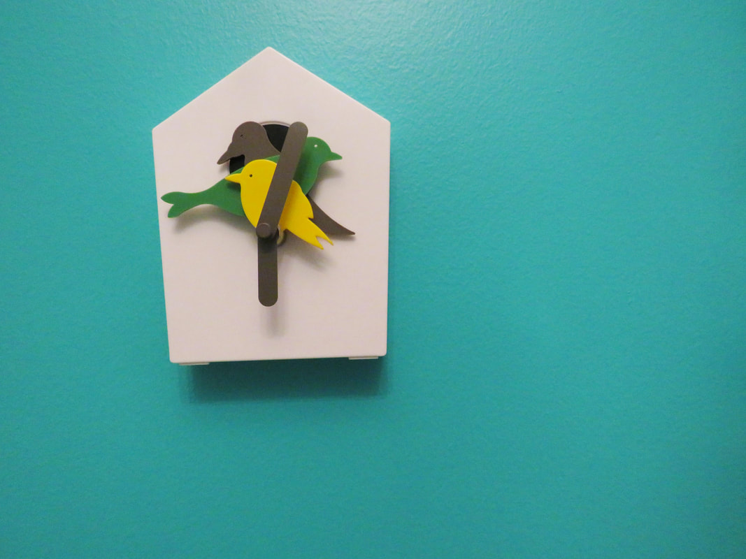 This photo, like the simplicity photo, is simple and uncluttered. This allows the clock to have all of the attention. - Unity - 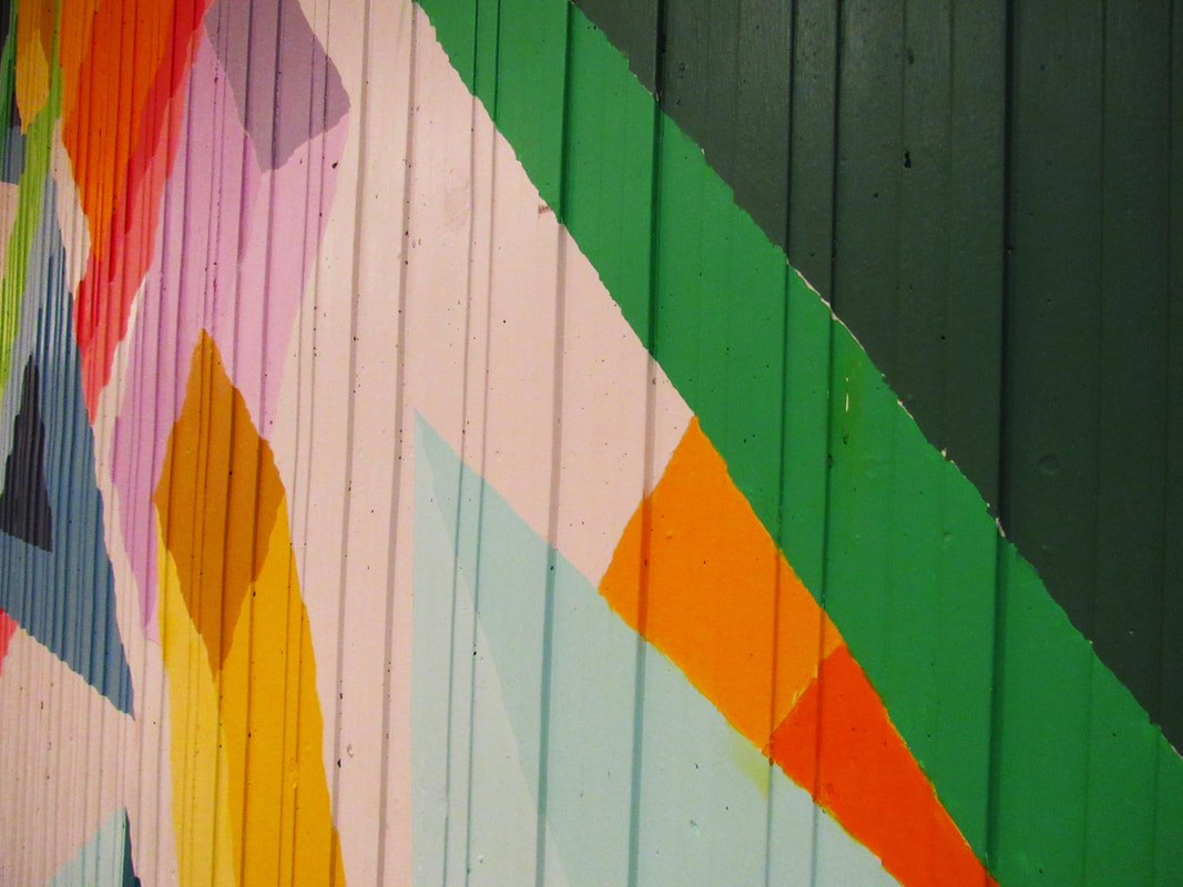 This photo may also be a stretch, but the colors and shapes of the mural work together to create the larger picture. This assignment was a lot like the composition assignment of photography 1, but it was still fun. I was a bit rusty from the year and a half break since digital photography 1, however, I think I'll get back into it soon. It was difficult to find opportunities to take all of these different photos because of how busy this week was. Hopefully I'll have time over the break to practice more!
0 Comments
Welcome back! All photos above this post will be for 3rd hour digital photography 2. It's been a while since I've used this blog last (2 years!), but I'm happy to be back. I can't wait to learn more photography techniques and tricks!  |
